
Colorful Cocktail Reception Florals
By Petals & Loam
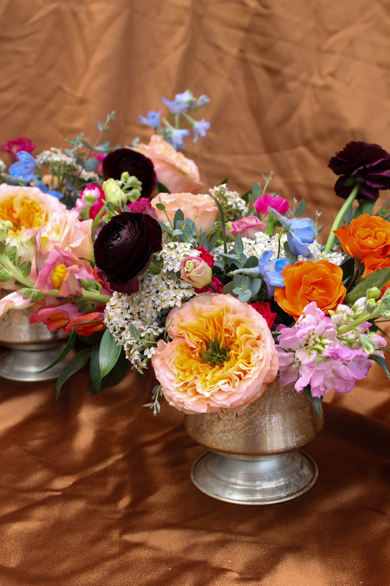

Colourful Graduation Floral Arrangements
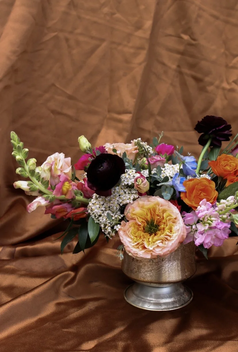
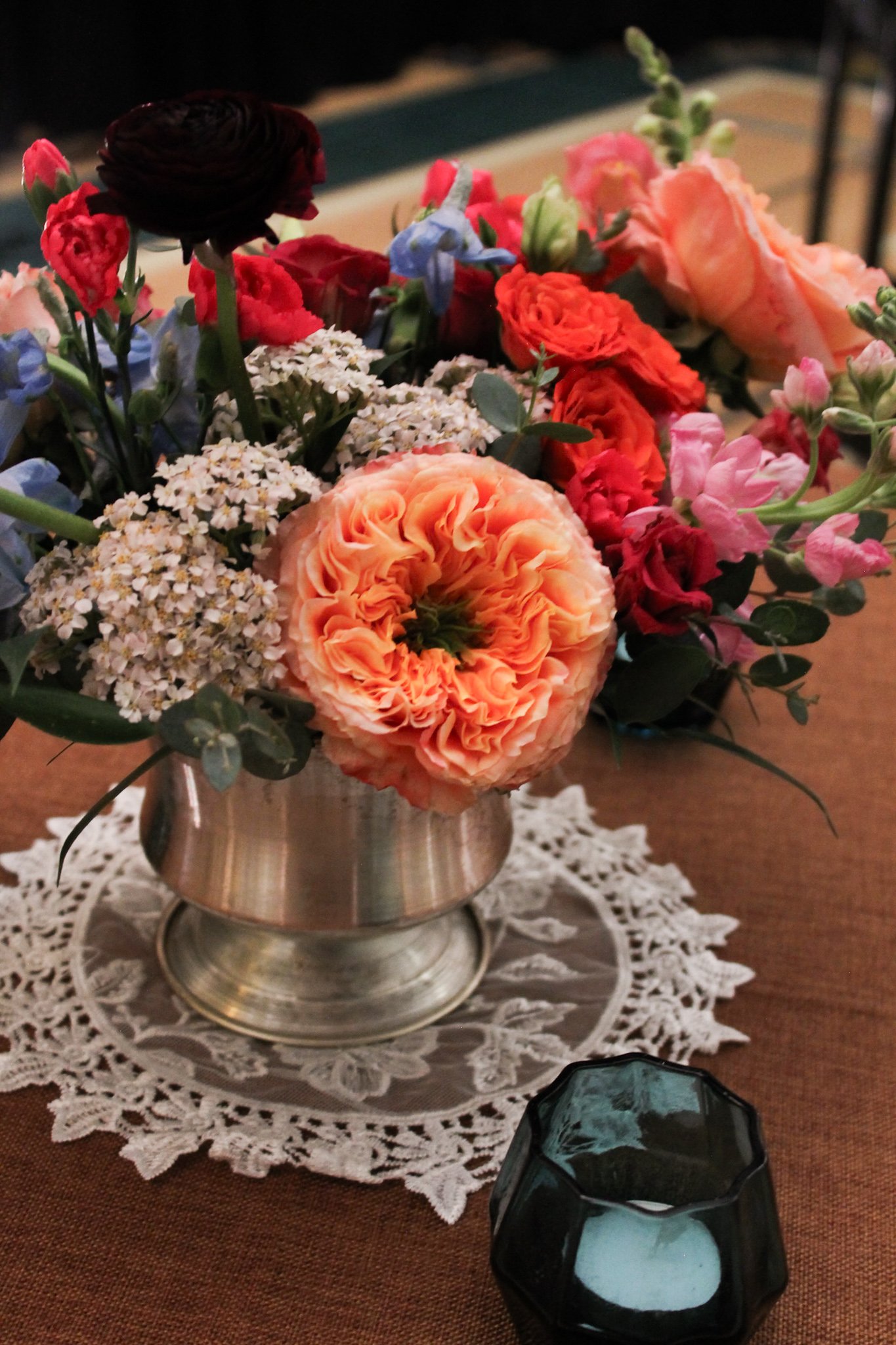
As you know, we love colour at Petals & Loam so when we were asked to design colourful centerpieces for a graduation cocktail reception this spring, we were thrilled. With a colour palette of copper, pale blue, and burgundy tones being used for linens and decoration, we were given free range to decide what colour palette to use for the florals.
The Use of Mock-Ups In Floral Design
Initially, we played around with pale pink, neutrals, a touch of peach with pops of red for the design, but something was missing. We then leaned into a more peachy, fuchsia, red, and pink colour palette but things still didn’t feel quite as right.
We always like to make mock-ups for our clients because they are such a helpful tool to use for ourselves and for the client. I really felt like we should lean into the pale blue tones that were going to be used in the decor to tie things together, and once we made a mock-up using blue delphiniums, that is what sold our client on the design.
We design all of our mock-ups without the use of AI because we feel there is much more freedom when we choose our own images and because we care deeply for the environment and understand the negative social impacts of the use of AI.
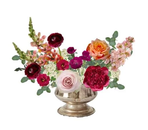
Option 1: our first iteration with pinks, reds, neutrals, and some peachy tones
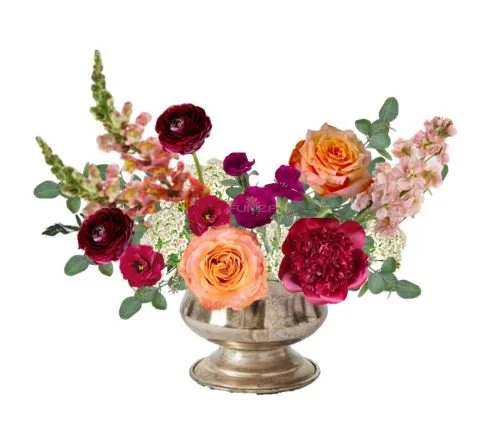
Option 2: we refined the colour palette to a richer, more peachy toned design
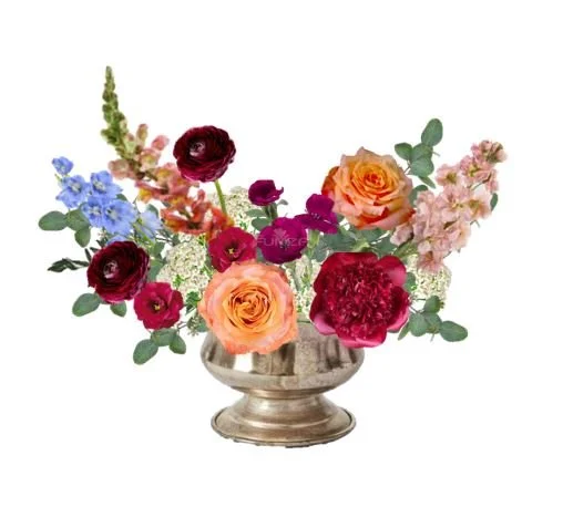
Option 1: pulling in a touch of pale blue was what we felt would tie the whole design together
Choosing the Right Colours
Choosing the right colours for your event flowers is the most important part of creating a successful design. We like to pair unique colour combinations in our designs because we find that there is so much joy in colour. With that being said, there are rules that we like to follow to create a beautiful, and interesting colour palette.
We always like to design with a few shades of the same colour to create depth and dimension. Then, we look to colour theory to help us design the rest. Often we use complimentary, split complimentary colours, or even triad colours when designing to ensure that we will create something cohesive and visually appealing.
By adding peach roses and pale blue delphinium, we played with complimentary colours and built on from there. We used shades or oranges and pinks and reds in this design (also known as analogous colours) as our base and then accented with blues and purples from there and we’re so happy with how these arrangements turned out!

Choose Petals & Loam as your Calgary Wedding & Event Florist
If colour speaks to you the way it speaks to us, please inquire with us today! We’d love to be your florist for your Calgary wedding or event and create something unique for your ceremony, product launch, cocktail hour, and/ or reception.